-
Vector images
Vector images are essentially giant math equations, and each dot, line and shape is represented by its own equation. Every “equation” can be assigned a color, stroke or thickness (among other styles) to turn the shapes into art. Unlike raster images, vector images are resolution independent.
-
Raster images
Raster images are made up of a set grid of dots called pixels where each pixel is assigned a color. Unlike a vector image, raster images are resolution dependent, meaning they exist at one size. When you transform a raster image, you stretch the pixels themselves, which can result in a “pixelated” or blurry image.
-
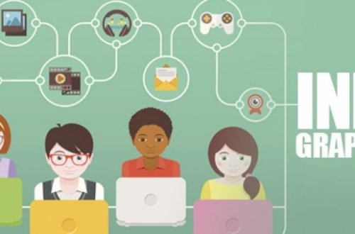
How to Effectively Use Infographics in Your Blog
With millions of articles being published each day, bloggers need to be extra creative when it comes to their marketing strategy. A modest budget will help you to launch display ad or video marketing campaigns. But for cash-strapped marketers, investing in visual content like infographics can be the best step forward.
-
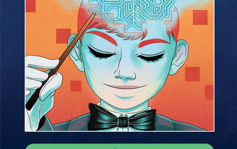
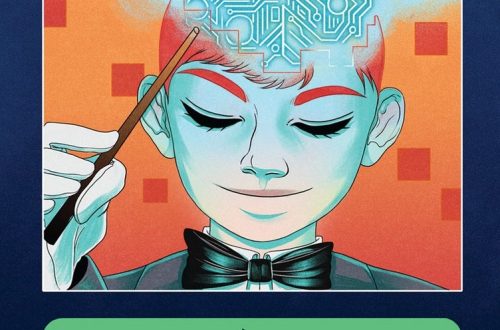
Can Artificial Intelligence impact art in the 21st century?
In early February, Aparajita Jain was standing in front of a blackboard in Bengaluru, brainstorming ideas on art and technology with two very creative minds—Lalitesh Katragadda, the creator of Google Maps India, and multidisciplinary artist and TED speaker Raghava K.K.—when it struck her: AI (Artificial Intelligence) had dipped its metaphoric toes into the realm of art. “We were working on a technological platform together in Raghava’s home in Bengaluru. Right then he told me that AI was creating art,” recalls Jain, who is the co-director of the Nature Morte gallery in Delhi.
-
Prix Ars Electronica 2019: Artificial Intelligence & Life Art
Every year, it’s one of the most important events in media art: When the winners of the long-standing Prix Ars Electronica are announced, creative minds from all over the world watch closely.
-
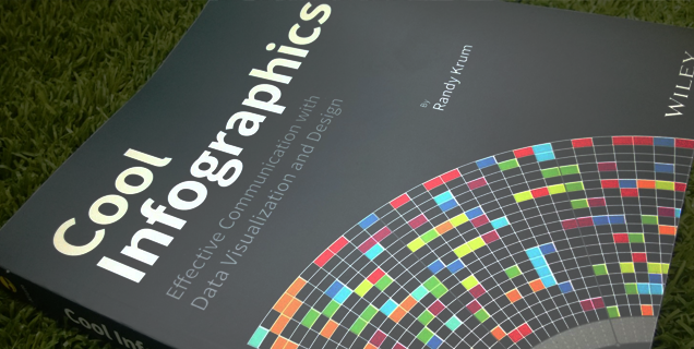
Top 5 Best Sites to Make Cool Infographics
Many say that a picture is worth a thousand words. Honestly, it’s worth that only if you present everything beautifully. With the attention span of the average human declining rapidly, it’s now more important than ever that you put your thoughts across clearly and concisely. And that’s when Infographics come into the picture.
-
A new image format for the Web
WebP is a modern image format that provides superior lossless and lossy compression for images on the web. Using WebP, webmasters and web developers can create smaller, richer images that make the web faster.
-
How Do You Know When It’s Time to Rebrand?
When companies change their logos, it can sometimes be confusing to consumers on why. The old one looked just fine. But there are good reasons to change a brand or logo. How Do You Know When It’s Time to Rebrand infographic explains six different reasons why a company would decide to change. It’s a fact of life that sometimes things have to change. Logos and brands, just like people, also need makeovers. Some logos change after many years, while others change every 10 years or even less. While some of the most common reasons for rebranding are mergers and acquisitions, other developments such as a change in staff, a new…
-
How The World is Getting Better in 6 Charts
The World as 100 People Over the Last Two Centuries is a good summary from Our World in Data, a website dedicated to capturing the story of human progress in the form of data visualizations, of their much longer article about the history of global living conditions and why it matters that we know it. For our history to be a source of encouragement we have to know our history. The story that we tell ourselves about our history and our time matters. Because our hopes and efforts for building a better future are inextricably linked to our perception of the past it is important to understand and communicate the…
-
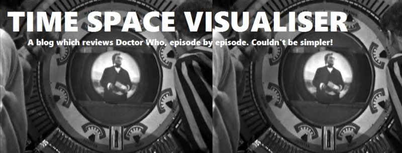
Time & Space Visualizer
Time & Space Visualiser by Paul Smith from Wonderful Books is the first exploration of both the factual and fictional history of Doctor Who through a range of infographics, presenting information about the show. As the famous TV series nears its 50th anniversary, this book takes a fresh perspective, visualising information from every aspect of the programme to show there are lots of options beyond lists and tables. Each chart is accompanied by detailed notes discussing the background and context of the areas under examination, how the data was compiled and what it reveals. The results can therefore be appreciated by those interested in the possibilities of data visualisation while…