-
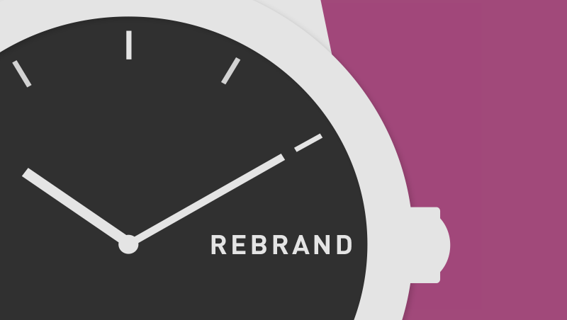
How Do You Know When It’s Time to Rebrand?
When companies change their logos, it can sometimes be confusing to consumers on why. The old one looked just fine. But there are good reasons to change a brand or logo. How Do You Know When It’s Time to Rebrand infographic explains six different reasons why a company would decide to change. It’s a fact of life that sometimes things have to change. Logos and brands, just like people, also need makeovers. Some logos change after many years, while others change every 10 years or even less. While some of the most common reasons for rebranding are mergers and acquisitions, other developments such as a change in staff, a new…
-
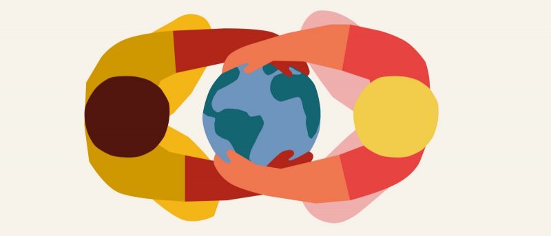
How The World is Getting Better in 6 Charts
The World as 100 People Over the Last Two Centuries is a good summary from Our World in Data, a website dedicated to capturing the story of human progress in the form of data visualizations, of their much longer article about the history of global living conditions and why it matters that we know it. For our history to be a source of encouragement we have to know our history. The story that we tell ourselves about our history and our time matters. Because our hopes and efforts for building a better future are inextricably linked to our perception of the past it is important to understand and communicate the…
-
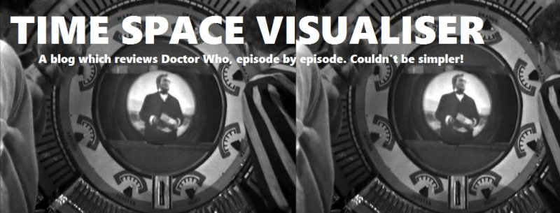
Time & Space Visualizer
Time & Space Visualiser by Paul Smith from Wonderful Books is the first exploration of both the factual and fictional history of Doctor Who through a range of infographics, presenting information about the show. As the famous TV series nears its 50th anniversary, this book takes a fresh perspective, visualising information from every aspect of the programme to show there are lots of options beyond lists and tables. Each chart is accompanied by detailed notes discussing the background and context of the areas under examination, how the data was compiled and what it reveals. The results can therefore be appreciated by those interested in the possibilities of data visualisation while…
-
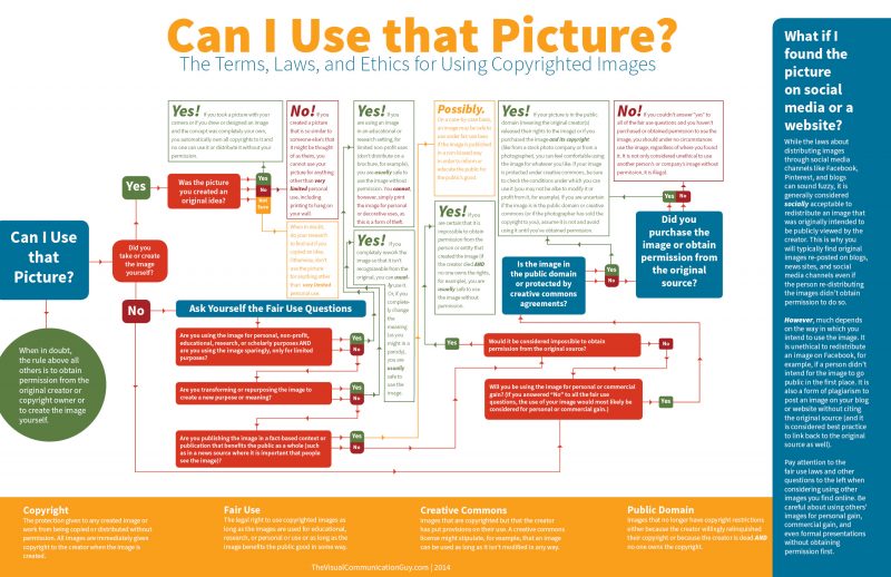
Can I Use that Picture?
The internet grants us access to lots of images. But how do we know if we have legal or ethical use of the photo? Check out the Can I Use this Picture? flowchart from Curtis Newbold, The Visual Communication Guy before you make your next powerpoint slideshow. Need to use an image but not sure if you have the legal and ethical right to do so? Understanding the laws for using images can be a bit tricky, especially because there is wiggle room within the laws. And, with the mass distribution of images on the internet, it’s no wonder we’re all asking the the same question over and over again:…
-
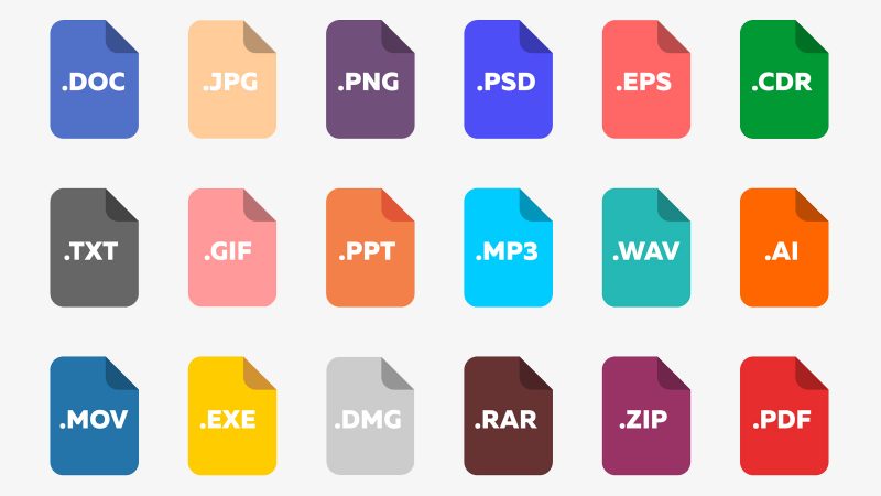
Image File Types Decoded
So many choices when saving your images! The Image File Types Decoded infographic from tekRESCUE does a great job of clarifying the options in this handy infographic! Information technology can get complicated very quickly, and digital image files are no exception to this rule. You’ve likely come across a few of the different types of image files such as JPEGs, GIFs, PNGs, and others. You’ve also likely wondered what the difference is between all of these different abbreviations. That’s why we’ve put together an infographic comparing some of the most common types of files you’re likely to encounter on and create for the web. In the graphic, we take a…
-
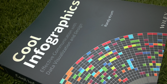
Cool Infographics
Effective Communication with Data Visualization and Design Your data tells a story. Make it unforgettable! A cool infographic tells a story visually — an engaging story built with your data. More than just using pictures or colorful charts, infographics create the type of visual information that your audience will quickly grasp and remember. Inside, the fundamentals of infographics are clearly explained for both novices and experienced professionals. Cool Infographics: Effective Communication with Data Visualization and Design By Randy Krum It’s an Amazon Best Seller in the Data & Information Visualization and Graphics & Visualization categories! What people are saying in the Amazon Reviews… “This book is a great overview data…
-
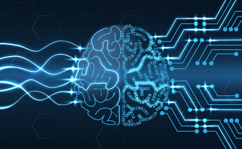
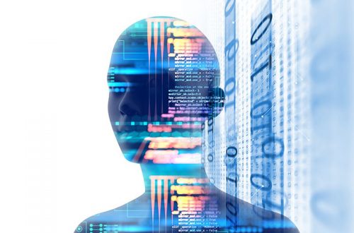
How Artificial Intelligence Is Changing Art
Using Artificial Intelligence to create works of art is a very controversial topic, and Invaluable has tackled explaining the issue with the infographic How Artificial Intelligence Is Changing the Face of Art and a detailed blog post. This issue applies to fine arts, music, writing, dance and even the culinary arts! When can it truly be considered “art”? Who owns the final creative works? Over the past 50 years, artists have been using computers to generate forms of digital art, but previously had to write the code that specified a set of rules to create the chosen aesthetics. Within the last couple of years, artists have taken AI art to…